ShopDreamUp AI ArtDreamUp
Deviation Actions


Suggested Deviants


Suggested Collections


You Might Like…


Featured in Groups


Description
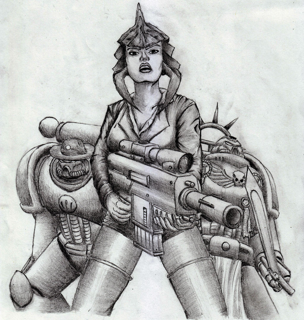
Thank you,  , for commissioning me.
Featuring her as an anthropomorphic Ravener, her OC Sergeant Lee Sanders, and Thunderpsyker, who makes videos. It was fun to make this, with not-exactly-new but only-recently-applied techniques with pencil. Not a lot of detailing compared to other pieces, but the shading is an accomplishment I'm proud of. Edited digitally in Pixlr Express to improve contrast.
That blank space between her glorious legs should have been darkened digitally to match the original, but every attempt just looked weird compared to the rest of the picture.
2B pencils on A4 paper.

, for commissioning me.Featuring her as an anthropomorphic Ravener, her OC Sergeant Lee Sanders, and Thunderpsyker, who makes videos. It was fun to make this, with not-exactly-new but only-recently-applied techniques with pencil. Not a lot of detailing compared to other pieces, but the shading is an accomplishment I'm proud of. Edited digitally in Pixlr Express to improve contrast.
That blank space between her glorious legs should have been darkened digitally to match the original, but every attempt just looked weird compared to the rest of the picture.
2B pencils on A4 paper.
Image size
3806x4000px 19.49 MB
© 2016 - 2024 sciencevsart
Comments11
Join the community to add your comment. Already a deviant? Log In
hello I am coming from the ICT of  with the tag word "weapon"
the choice for this picture is more or less obvious I think! The gun aka weapon caught my eye!
i will start with pointing out things I like before going to the things to improve~
Firstly: the composition!
It is really simple central composition, but in this case it works really well and nothing more complicated is needed! It manages to show off both of the original characters really well as well as the canon one!
secondly: your work with the details on characters.
Of course I can't praise you for designing the characters, but you have portrayed them really well! It seems like no detail was forgotten! Even if there was, it doesn't seem important or necessary! You have also managed to make the robot characters seemingly alike, but highly different at the same time! and I adore that idea!
Thirdly: the expressions:
those really show off the mood of the drawing! and even the metal faces seem to have personality and expression and I am well aware that it's hard to achieve!
So the improvement part~
the main thing I have noticed not only in this picture, but trough all of the gallery. It's the fact that your work lacks "color". Everything seems to be in one tone. the only exception would be the female character's hair. That's the only thing that's darker! But right now it seems that her face, jacket, boots and the metal of gun and robots are in the same shade thus - same color.
to avoid this I'd suggest you to start off with placing the base shades before you would start to shade! in this way you would make sure the picture has all different shades, all different values! It will create greater dept of your picture and make it look more life like! only when you are happy with the tonality of the whole peace, you would start to adding shades and lights! but be careful to not overdo any of those and thus killing the tonality you previously created!
Now your turn to comment on Tuntalm's gallery, with the tag word "grip". Good luck !
with the tag word "weapon"the choice for this picture is more or less obvious I think! The gun aka weapon caught my eye!
i will start with pointing out things I like before going to the things to improve~
Firstly: the composition!
It is really simple central composition, but in this case it works really well and nothing more complicated is needed! It manages to show off both of the original characters really well as well as the canon one!
secondly: your work with the details on characters.
Of course I can't praise you for designing the characters, but you have portrayed them really well! It seems like no detail was forgotten! Even if there was, it doesn't seem important or necessary! You have also managed to make the robot characters seemingly alike, but highly different at the same time! and I adore that idea!
Thirdly: the expressions:
those really show off the mood of the drawing! and even the metal faces seem to have personality and expression and I am well aware that it's hard to achieve!
So the improvement part~
the main thing I have noticed not only in this picture, but trough all of the gallery. It's the fact that your work lacks "color". Everything seems to be in one tone. the only exception would be the female character's hair. That's the only thing that's darker! But right now it seems that her face, jacket, boots and the metal of gun and robots are in the same shade thus - same color.
to avoid this I'd suggest you to start off with placing the base shades before you would start to shade! in this way you would make sure the picture has all different shades, all different values! It will create greater dept of your picture and make it look more life like! only when you are happy with the tonality of the whole peace, you would start to adding shades and lights! but be careful to not overdo any of those and thus killing the tonality you previously created!
Now your turn to comment on Tuntalm's gallery, with the tag word "grip". Good luck !