ShopDreamUp AI ArtDreamUp
Deviation Actions


Suggested Deviants


Suggested Collections


You Might Like…


Featured in Groups


Description
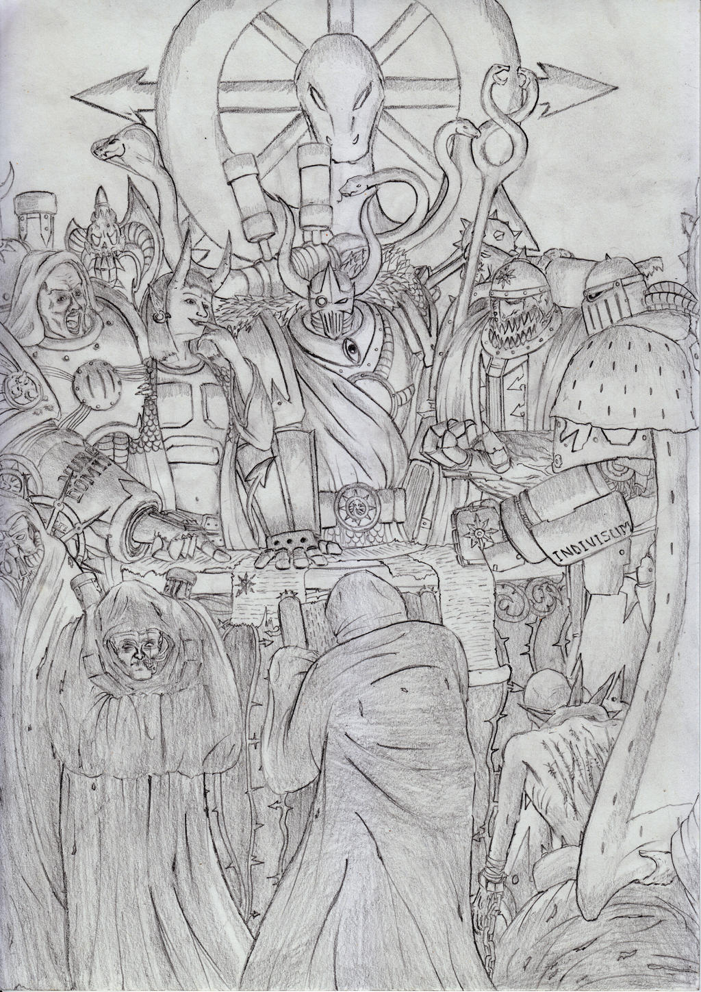
Verteros, Champion of Nurgle; Dana, the Daemonette; Darkminster, Grand Sorcerer; Argus, Tzeentchian Prince; Isaq, Sorcerer of Chaos Undivided.
Zoom in to see all the delicious, delicious details.
Theme song.
Thanks to for commishing me. 11/10 would carpal tunnel again.

Zoom in to see all the delicious, delicious details.
Theme song.
Thanks to
for commishing me. 11/10 would carpal tunnel again.Image size
4960x7015px 12.82 MB
© 2015 - 2024 sciencevsart
Comments32
Join the community to add your comment. Already a deviant? Log In
Tag! You're it... after my lengthy yet best ever comment!  (Smile)") (Comment Tag from Project Comment)
(Comment Tag from Project Comment)
To start, I've done a few pictures over the years with multiple characters, and they are always incredibly time consuming. What's more, I always find that a couple of the characters suffer in the details department because I either forget or just don't have the patience. I must say, I don't see any of that in this! Every character has something going on and they all seem equally detailed. I don't think a lot of people truly appreciate how long or demanding the larger compositions like this can be.
I think your composition is well done. The first thing the eye lands on is the very middle character, but then there is so much to explore the eye just seems to go on a natural spiral around the picture. I think it was good to leave the top and bottom with less details so the picture wouldn't be really cluttered.
Now with all the details you have in here, I think it's really cool how you have the lettering on some of the gauntlets of the soldiers at the edges of the picture and how most of the characters have differences to their attire so they are individuals. That being said, it is a little hard to read because of all the things that are going along with the line weights you use. I think you have good line work, but you don't use too much different in the weight of the lines. I think you will find that if you had nice bold outlines for the larger shapes of each character and then maybe some medium weight lines around some of the pieces you want to stand out about the character (for example the piece on the chest of the guard all the way on the left). But especially some big bold outlines around the characters so we can distinguish them between each other.
I think you have a really cool style and I love how much detail you put into each of your works. Well done.
Your tag for Black-Chimera is 'Highlights'